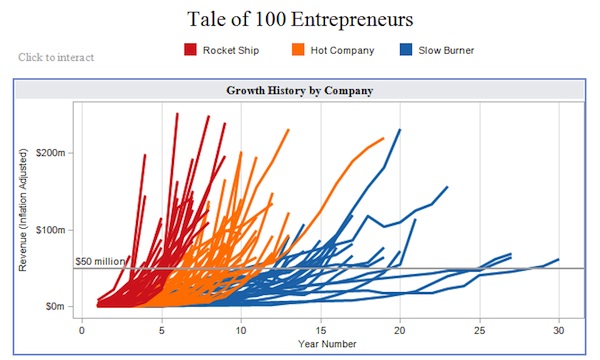
Wow. Yesterday, I saw a demo of Tableau, a software package for doing “visual analysis” of databases and other raw datasets. I was amazed. That is one of the coolest pieces of software I have ever seen.
In a nutshell, Tableau makes it incredibly easy to visualize the patterns and relationships in just about any dataset you point it at. These visualizations are largely driven by drag-and-drop and let you quickly explore and analyze data to find structure, trends, and insights. These visualizations are all interactive, so you can zoom in on individual items, filter subsets of data, link several different visualizations into a multi-pane dashbaord — all point-and-click.
It’s fun, creative, and inspiring.
This beats the pants off of the typical Excel report. As Jock Mackinlay, Tableau’s Director of Visual Analysis, said, “The human visual system is very good at looking at data presented visually — compared to being very slow at “mental math” with just tables of numbers.” Tableau was designed to tap into our visual intuition, and it does so marvelously.
If you’re into marketing analytics, budding as a data scientist, you should run — not walk — to download their free trial. The professional desktop version runs $1,999, which isn’t cheap, but if you’re an analytics professional, it’s well worth it.
Also, check out Tableau Public, which is a free version of Tableau that can be used to publish and share public data visualizations. It’s primarily meant for journalists and bloggers, and includes some terrific examples of what Tableau can do — such as an example of how fast successful tech companies grow.
Get chiefmartec in your inbox
Join 42,000+ marketers and martech professionals who get my latest insights and analysis.
