Maybe it’s the Mad Men marketer in my hybrid DNA, but I’ve always been a little underwhelmed with Google AdWords.
The business model of pay-per-click (PPC) is great. The ability to scale to thousands of micro-targeted ads is great. The analytics and testing capabilities are pretty good. And, hey, major hats off to intercepting buyers at their moment of expressed “intent.”
But the design canvas — trying to market to people with a maximum of 135 characters of plain text — always seemed really low-fidelity to me.
In essence, search advertising in Google (and Yahoo!, Bing) had only four levers to pull:
- The keyword phrase on which the ad appeared (context)
- The text of the ad — a mere 135 characters of plain text
- The position of the ad on the page as a faint signal of quality
- Any brand equity the advertiser had previously established
That was fine 10 years ago, but what’s changed since then? Marketers have done a lot with very little, but compared to the other media where marketers ply their craft — such as the post-click marketing space, which I know and love — search marketing has been terribly constrained.
And although Google’s spartan page design could be considered a feature — at least it originally was — I’ve increasingly doubted that those constraints truly serve the needs of users. It’s really hard to tell which ads will deliver on a user’s intent.
Google Instant Preview and Google +1
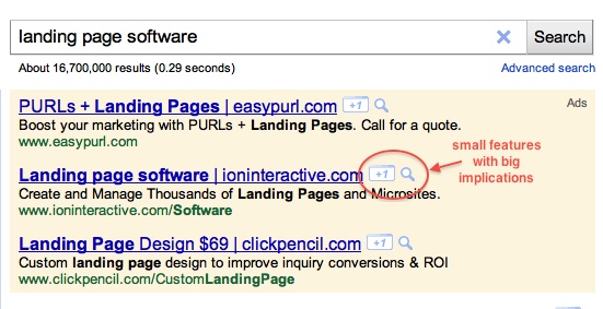
But recently, Google unveiled a couple of small features with big implications for search marketing: Instant Preview for Ads and Google +1 for Sites.
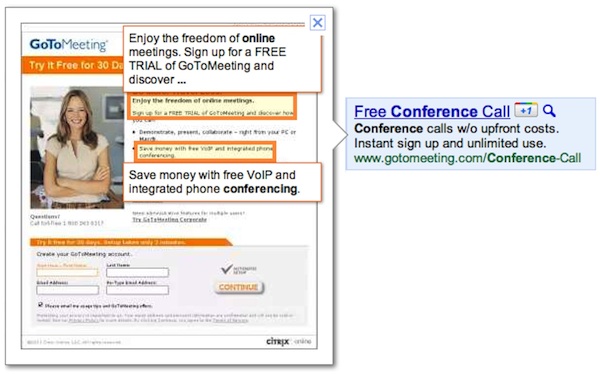
With Instant Preview, a little magnifying glass appears next to ads that lets users see a thumbnail and brief snippets of text from the landing page that the ad links to. Once a user clicks on a magnifying glass, they can zoom around the search results page — comparing the landing pages of all the ads and organic results — before they click through on any of them.
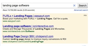
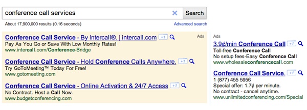
So instead of making a click choice based solely on a stack ads like this:
Users can take a look at the actual experiences these advertisers will deliver. Do they intrigue? Impress? Fulfill the promise implied (or stated outright) by the ad? If users aren’t satisfied with the preview, they simply won’t click.
In a recent Search Engine Land article, Google Instant Preview: A Game-Changer For Landing Pages, I observed that this raises the importance of several post-click marketing best practices:
- Design matters — a landing page that looks good can now send a signal of the quality of the advertiser (as can a page that looks like junk)
- Message match matters — the promise that the ad makes should be reflected in the copy and imagery of the landing page (even inadvertent bait-and-switch will be poorly received)
- Avoid long forms — especially on page one; instead use behavioral choices or multi-step experiences to do “progressive conversion” of respondents
- Do A/B testing carefully — to avoid unintended mismatch, pair ads and their landing pages in your A/B tests, so the preview always reflects the actual landing page
In the hands of a creative and enterprising advertiser, this opens up a huge opportunity for competitive advantage. Any competitor can copy the text of your ad. But it’s much harder to imitate compelling and meaningful post-click marketing experiences. Imagination, daring, design values, and the operational capability to match ads and landing pages at scale are not easily copied.
Combined with the new Google +1 button — Google’s equivalent to the Facebook Like buttons proliferating the web — users can now give a little “social love” to advertisers that deliver great post-click experiences. In turn, those +1’s will register on the ads when other users in those social circles see them — a nice positive feedback loop. Are your landing pages +1 worthy?
Suddenly post-click marketing has moved from the middle of the funnel to the top.
Post-Click Marketing at MarketingProfs B2B Forum
Next week, I’ll be speaking at MarketingProf’s B2B Forum in Boston on the topic of post-click marketing — including up-to-date best practices arising from these new Google AdWords innovations.
I’ll be in a session with Sally Lowery of iContact, who will be sharing a marketer’s perspective of implementing post-click marketing strategy and tactics in an organization. Sally has amazing experience to share, so I’m thrilled to be presenting with her. If you’re at the event, please come up and say “hi.”
If you can’t make it in person, you can attend online. (You can use the code POSTCLICK to save 30% on the online registration.)
Get chiefmartec in your inbox
Join 42,000+ marketers and martech professionals who get my latest insights and analysis.


